Some new old photos (but are they any good?)
Primary tabs
We'll start with some photos and postcards I bought last month. Then as I've been arguing with the book designer about what makes a good photo, we'll take a look at that too.
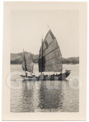
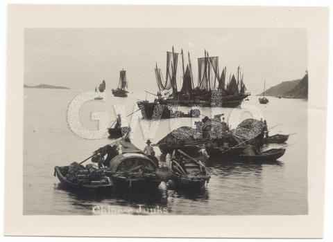
The seven photos are all the small type that were typically sold to tourists to go in to their photo album. In this case I don't see any sign that the photos were mounted, so the original owner probably just kept them loose. (As always, you can click on any photo to see a larger copy you can zoom in to.)
The group also includes two postcards.
So, which of these are any good?
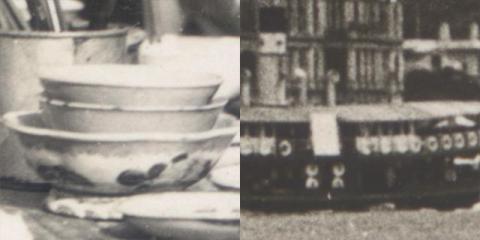
The designer who is currently working on the layout of the Gwulo book complains that several of the images I've given her are 'too fuzzy', and aren't suitable for printing. These unsuitable images are blown-up areas of a larger photo that show some detail I want to write about.
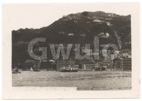
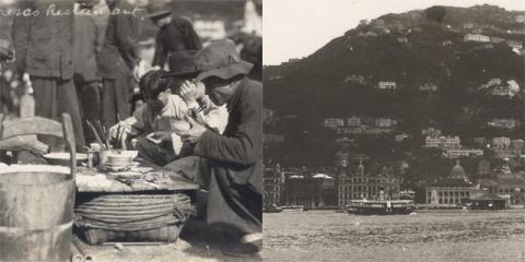
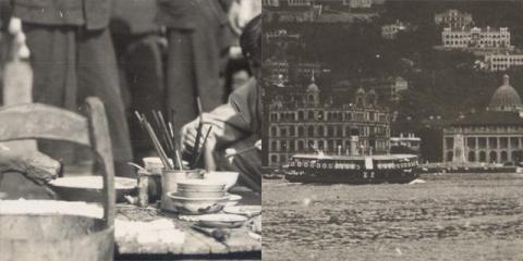
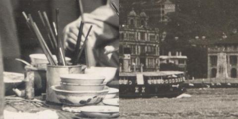
How well would this set of photos blow up? Compare the postcard with the small photo showing the view from the harbour.
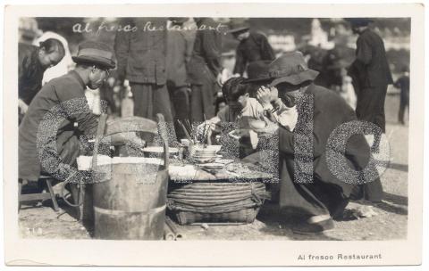
I guess the designer would find the view from the harbour getting fuzzy around the 2x blow up, but would be ok with the larger Al fresco postcard up to around a 4x blow up.
It's not surprising that the postcard blows up better, as it's around twice the size of the small photo. So when looking for an old photo to blow up, bigger is usually better. Except...
Apart from the size of a print, we also need to consider how it was printed. The black & white pictures in this set were all printed using a photographic process, but the colour postcard was printed on a printing press. It is an attractive view, but we can't blow it up very much before we see the coloured dots that were used during printing.
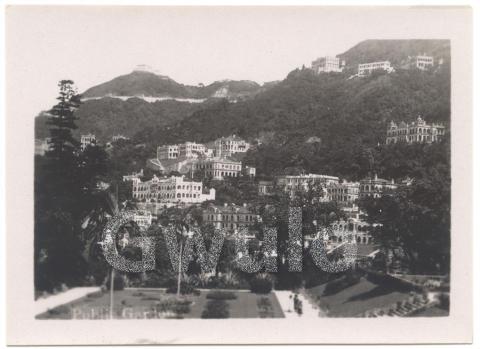
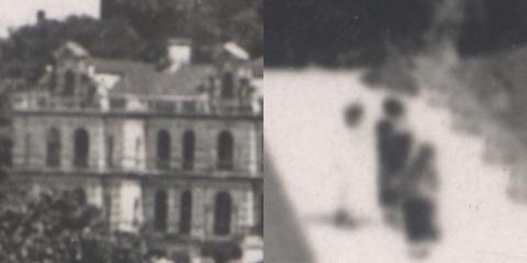
We can even see significant differences in blow-upability within a single photo. The photo of the public gardens is a good example.
I've blown up a building from the centre, and three people from the bottom of the photo. Camera lenses give their best results in the centre of the photo so the building is quite sharp. But as you can see the edges capture less detail and don't blow up as well. The three people at the bottom of the photo are just a blur.
Learning to live with fuzzy photos
If we want to print a typical coffee-table photo book, we'll certainly need to stick to large photos that will blow up well, and look sharp when printed. But that isn't the book I have in mind.
I want to show readers the clues I've found in a photo, even if that means accepting a bit of fuzziness. Often I'm grateful to see the clue at all, and don't mind that the blown-up detail isn't super-sharp. So I've replied to the designer that she's absolutely right, some of the blown up photos aren't very clear. But that it doesn't matter.
I haven't convinced the designer yet, and I'm not sure I will. But I'm hoping readers will understand.
An example of a fuzzy clue
Where was the Al fresco postcard taken?
When I first saw this postcard for sale, I was struck by the how similar the subject and style are to another card I bought a few years ago:
We worked out the location for that postcard was Happy Valley, from the fuzzy tower at top-right.
The same tower is shown in the Al fresco postcard, so it was also taken at Happy Valley.
Trivia: These photos and postcards all came from a seller in Finland. I wonder how they ended up there?
|
New on Gwulo this week...
If you can leave a comment with any more information about these, it will be gratefully received.
Some of the new photos added this week:
Click to see all recently added photos. |


Comments
Enlarging photographs for printed books
You might not like this opinion, but I tend to agree with the book designer that there should be severe limitations on enlarging original photographs for printed publications. I have bought a number of books in the past in which the printed photographs are so poor I felt somewhat cheated if I had paid a lot for the book. This tends to happen with enthusiasts' books about particular subjects. We have to remember that readers may not be quite so enthusiastic about the detail as the writer and they become irritated by "poor pictures" .
A writer also has to take into account that publication process will also probably make use of a printing screen composed up of the dots which Gwulo refers to as already existing in the original image. The enlarged image may look acceptable for its purpose of 'zooming-in' and showing detail on a computer screen but a print-out of this will be "dots representing dots" and these are virtually impossible to align perfectly so you end up with bands on the image or crisscross lines known as "moire". Photoshop and other image editing software have filters for removing these lines but they are rarely 100% effective. In my last published book, I had over two hundred photographic images but one was very disappointing because I had (using Gwulo's term) "blown up it up" by about four times part of a photograph to show detail. In the book proof (digital version) it looked acceptable but when it was printed it became quite frankly an embarrassment.
re: Enlarging photographs for printed books
Thanks for the feedback. I think the enlargements will be acceptable as they're part of the story, but I understand that not every reader will agree. I'll post up some sample pages once the layout is finalised. That will let people see what they're buying, and help them decide whether the photo quality is good enough for them.